Popup size for mobile view
Issue description:
Sometimes popup displays properly on desktop, but cannot be viewed the same on mobile devices.
For instance, the popup is cropped, the close button does not fit into the mobile screen without rotation or any other size issues may arise.
Solution:
To resolve this issue, try adjusting the app width or popup positioning.
Follow the steps below to change app width:
Open app settings
Click on the "Design" tab
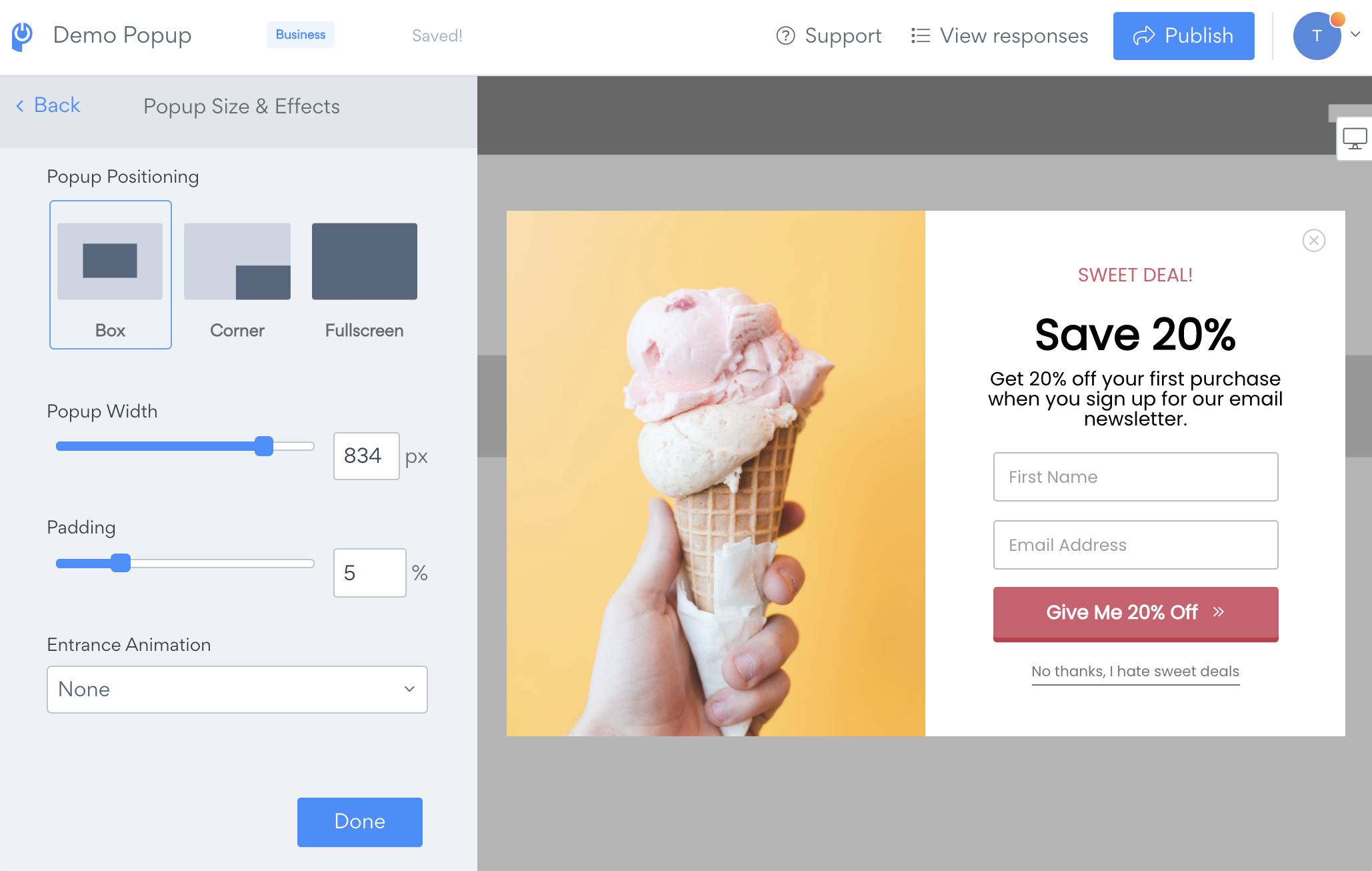
Open Popup Size and Effects and try to adjust the Popup Positioning, Popup Width or Padding.
If using a left or right image with your popup, you can select mobile-specific display rules. Change these settings in the Content tab, inside Layout. At thebottom of the settings, adjust the Image Position on Mobile Devices to hide or change the responsive stacking order.
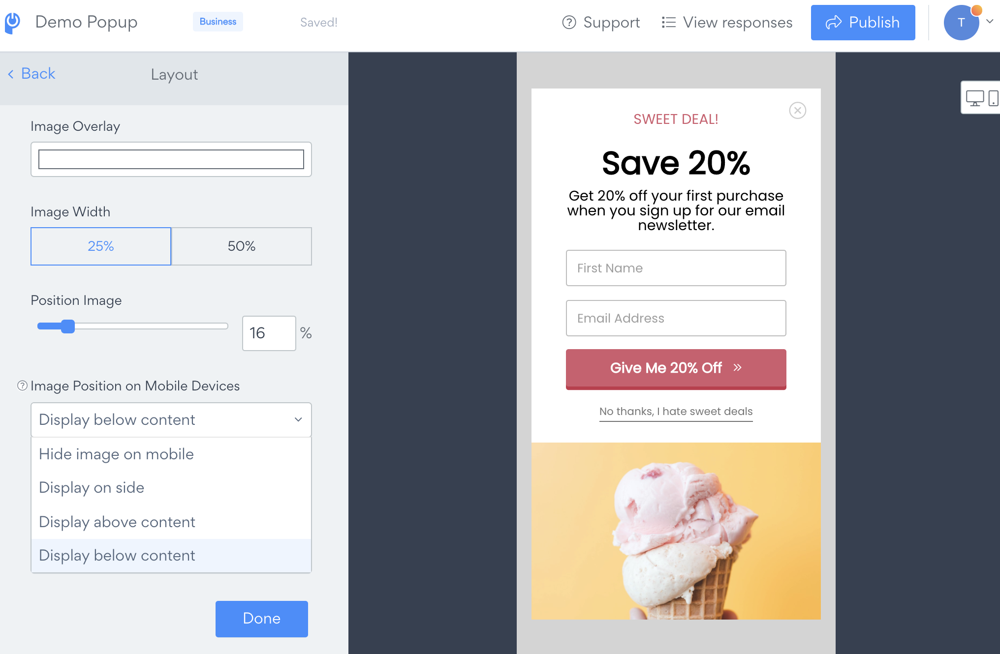
Please note, you can separately control the image layout for the Success screen under the Success tab, inside Layout.
Need Help?
If you need any help or have any questions about our Form Builder, our support team is happy to help.
👉 Contact our support team
When contacting us, you'll be prompted to authenticate your email by signing in, and a confirmation code will be emailed to you. This helps ensure our support team's reply will be delivered to you with no issues.
For more information about available features, visit our Pricing Page:
https://www.powr.io/pricing